Creative Exercise - Developing a concept

Introduction
Before I started the Google UX certificate, I had been studying various courses on UX through LinkedIn Learning. This series – facilitated chiefly by Chriss Nodder – was my first real introduction to UX, and what cemented my interest in the field.
At this time I had already completed several courses in business analysis and agile project management. I had many product ideas in my head, and had started keeping an innovation journal. After a discussion one night with my wife – who is a software engineer – about how we choose wine, she came up with the idea that she might like to develop an app to help her remember what wines were good and where to find them.
We talked about this – over a glass of course – and gradually came up with the idea for Vinny, which looked like this:
The key goal of Vinny was to allow anyone to add wines to a wine list in under a minute.
User accounts were optional, editing was optional. What was essential is that with two photographs you would have an accessible data entry which you could access at any time someone asked “What’s a good wine?”
Research
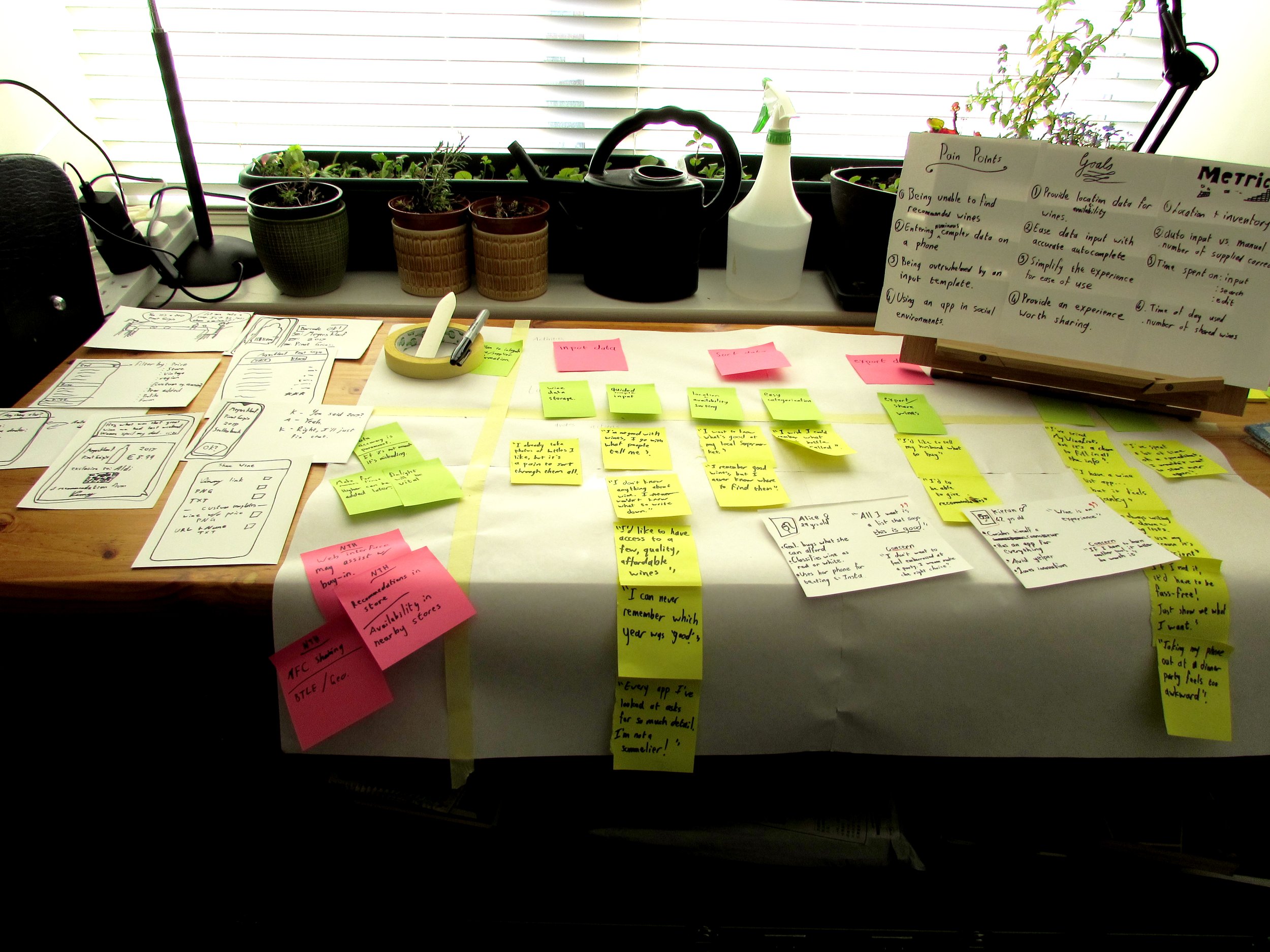
Being in lockdown, and having the time, we decided to analyse all our past conversations about buying wine. What’s a good price? What’s a good farm? Do you remember what vintages were good? How did we normally find bargains? Do you ever remember recommendations?
I started taking all of these points down, and we continued to analyse how we spoke about wine. While a sommelier may take the time to describe the bouquet and the pedigree, in our social circles we found there was generally only a scale of 2: good or bad.
Talking about wine can feel tedious to those “not in the know”, and no matter how many paper lists we keep or photos we take we never remember anything. What’s more, if we do have a list it feels socially awkward to be constantly updating your cellar recommendations when you’re supposed to be playing boardgames.
There were a few things we realised right up front:
This cannot be reliant on users entering information. There’s plenty of apps already out there for organising wine collections.
We will need to integrate with the systems that supermarkets and wine merchants use. Lists need to auto-populate based on barcodes as we enter them.
Failing access to a commercial database, some AI processing would be needed to turn the labels into usable data.
But we’ll leave that to the product team for the time-being, let’s focus on the experience.
You may pick up at this stage that my user base is far from desirable, and any of our decisions will be fraught with bias. You’re right. But this isn’t meant to be my million-dollar app idea. It’s just for us. And more so, it was for me to analyse our behaviours and our views objectively. Treating our memories as data sets, and practising some project work in the meantime.
Getting it in writing
Over the next few days I drew up an affinity diagram to organise my thoughts. Even without a design and research team it’s a great technique for extracting meaning from commentary.
These were synthesised into some useful pain points. Which could be used to develop features.
Gathering these thoughts helped me to create some personas. While I started out thinking about users like Alice who wanted simplicity above everything. It was also important to acknowledge the Kierans of the world who would want a detailed “cellar catalogue” inorder to cultivate “wine experiences”.
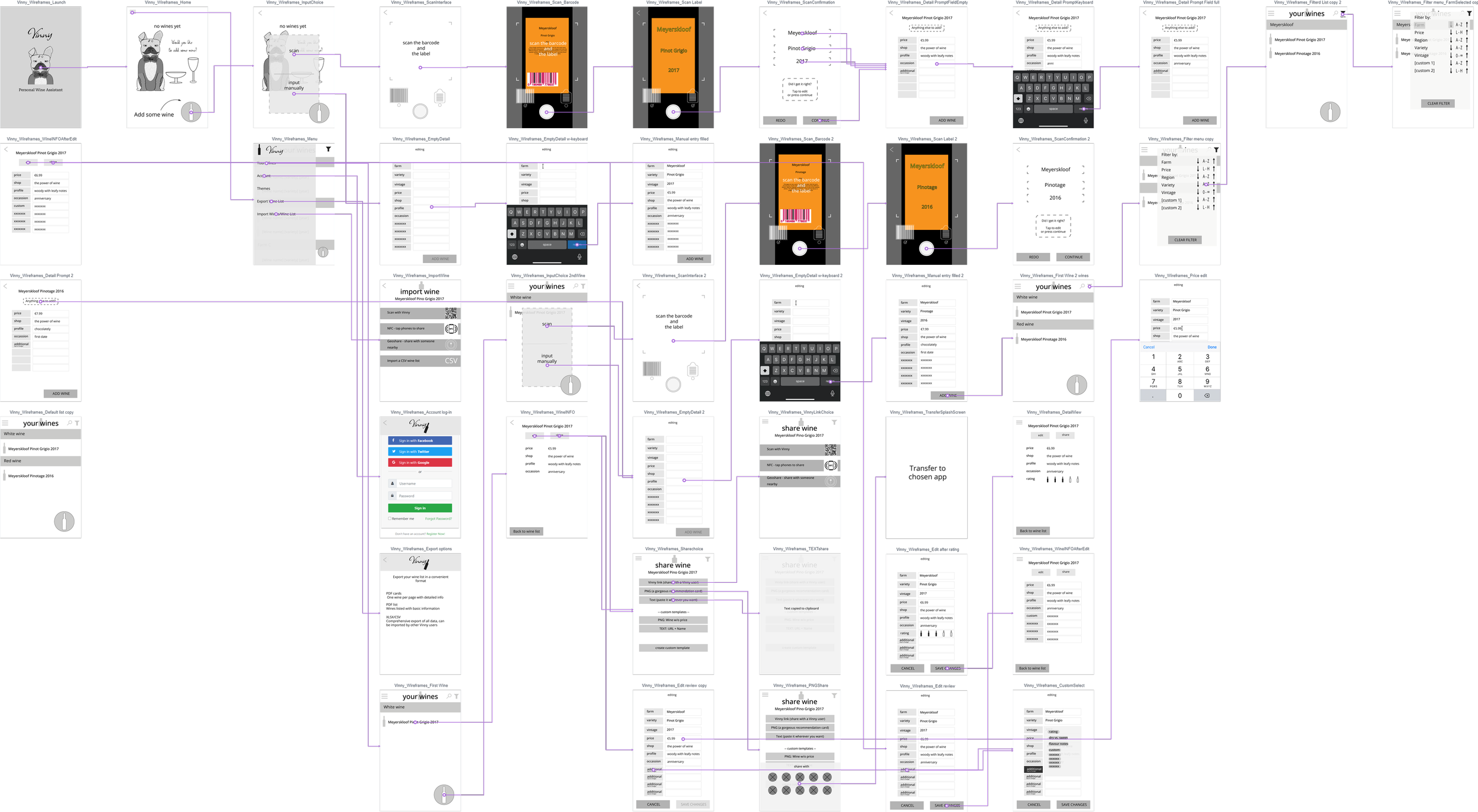
Taking this data, it was then possible to start on some basic wireframes:
Throughout the process I was able to establish what the core experience of Vinny should be: quick, effortless, delightful.
Vinny’s goal is to answer the question: “What wine can I buy that has been recommend to me, or that I have enjoyed before?”
Creating the experience
This being my first time designing an app I decided to stick to the tools I knew. My old-faithful Adobe CS6. From a time when it felt like software development was only open to computer scientists.
There’s a pro tip here: don’t design an app in Illustrator.
It’s a general problem with Adobe. The best work comes from using each app for its specified function. Draw vectors in Illustrator, rasters in Photoshop, layout in Indesign… or just do everything in Illustrator.
The problem here is that I was on familiar ground in unfamiliar territory. In order to orient myself I went straight to a medium fidelity design. I told myself to simplify the whole way through, but being the only one on the project I needed to visualise where things were going. I did, and successfully, but the mere capabilities of working in so advanced a tool means that you tend to be distracted by all the options.
I had to restrain myself to a simple greyscale system, and use layers to place comments and draw flows, only to get to the point of needing to prototype, and feeling a little stuck.
I took the opportunity to test out Prott and Marvel. Both of which are actually really great tools for prototyping, but based on you separating your work between two tools. You must design still screens in one app, and prototype them in another.
While you can do some design in them, it’s not nearly as fluid as Figma or XD – little did I know at the time. What these tools shine in though is usability tests. As you can quickly develop remote timed tests, record heatmaps, and get input from testers.
In terms of workflow, it feels laborious, and can separate the roles of visual and interaction design. If it’s being done by the same person it can work, but it doesn’t feel very agile.
Still, I did get my results.


Hurdle
Once I had reached this stage, and started to think about development I hit a major wall. How would this be perceived?
The name Vinny was developed over time to replace ideas such as: MyWineList, or CellarPal…
It all came from a Sunday morning drawing of our main man, Le Maître D’og
The thing is, this was functional. If we ever did decide to take this app to market, there’s something about having a French Bulldog as your personal sommelier. It’s a delightful way of guiding the experience, and I kept thinking of how we could manage onboarding with useful hints from this character. Taking inspiration from Duo the Owl from Duolingo.
Would it work though? Would it appeal to the whole wine market? I found myself at a crossroad. Stay with my mascot, or move ahead without him?
Vinny could be a delightful wine organiser that used thoughtful design to provide an entry point into the sophisticated world of wine.

But it could also be quirky, and character driven.

What I still don’t know is if it can be both. Should we keep him in the background as a mascot? Should we use him to drive engagement but risk creating another Clippy.
Or should we aim to keep the experience focussed on wine and lists?
By far my favourite part of this project was drawing, colouring, and digitally rendering this little guy. It seems wrong to leave him behind, and unviable to continue with him.

Conclusion
So what can I say for Vinny? My organiser app stuck in limbo?
Well firstly it was my first chance to really engage with the app design process. I got to fumble my way through and make something I valued. I also learnt that without adequate buy-in you can’t get a project out of the conceptual phase. Vinny could be worth developing but it’s unfeasible because it would rely on expensive backend resources. It also needs to resonate with various levels of users, by fulfilling a need. Vinny is a useful idea, but I’m not sure it’s a need that needs to be met. People who do keep lists of wine tend to take it seriously, and the rest of us know our regular choices, maybe a couple of farms we like, but otherwise tend to go by price.
Vinny may be revisited someday, but if he is, it’ll be by a team. My bias is that I only see Vinny from the creator’s viewpoint, and while I could go out of my way to conduct good user interviews and design the perfect experience, higher a developer, generate buzz with local off licences… Well this is why it’s fun to be part of a company.
In the meantime I have my own guidelines, which I’ll leave here:
When in doubt, go by year. Anything older than 2 years will probably be good.
After 7 years… it’s a mixed bag, be prepared for vinegar.
Wines from dry regions age faster (whiskeys too). French wines are light. South African wines are thick. All the rest fit somewhere in between.